spagg
spagg.RmdIntroduction
In this vignette, we illustrate how to use the spagg
package to analyze multiple spatial point patterns. In particular, we
will show how to use the functions in this package to construct an
aggregate spatial summary statistic across point patterns grouped
together by some higher level factor, such as by tissue sample. We will
then use this aggregated spatial summary statistic as a predictor in a
linear model for a group-level/sample-level outcome.
The motivation behind spagg is that analyses of data
from multiplexed immunofluorescence and spatial proteomics platforms may
involve multiple regions-of-interest (ROIs) imaged from the same tissue
sample. Each ROI shows the spatial location of cells in tissue which can
be treated as a spatial point pattern. Access to multiple ROIs per
tissue sample can complicate associative analyses seeking to
characterize associations between the spatial distribution of cells in
tissue and sample-level outcomes because we need to test for an
association between a single sample-level outcome (e.g. survival or
case/control status) and multiple spatial summary statistics.
This vignette will use simulated spatial point pattern data. To see
how this data was generated, please see
spagg > data-raw > simdata.R.
Loading in the Data and Plotting
We start by loading in the spagg package and our
simulated data. We show the first few lines of the dataset below. The
dataset is organized so as to mimic the structure of single-cell,
spatial images produced by multiplexed immunofluorescence and spatial
proteomics platforms. Each row corresponds to a detected cell, which is
enumerated by the cell.id column. The cells are grouped
together by samples, denoted by the PID column and by
images within those samples, denoted by the id column. The
x and y columns give the (x,y) coordinates of
each cell. The type column denotes the cell type for the
corresponding row. In this simulated dataset, the possible cell types
are a and b. Finally, the out
column gives the sample-level endpoint with which we are interested in
performing associative analyses. In this simulated dataset, the
out column is a binary 1 or 0
indicator.
# Load in packages
library(spagg)
library(ggplot2)
library(cowplot)
library(spatstat)
#> Loading required package: spatstat.data
#> Loading required package: spatstat.univar
#> spatstat.univar 3.0-0
#> Loading required package: spatstat.geom
#> spatstat.geom 3.3-2
#> Loading required package: spatstat.random
#> spatstat.random 3.3-1
#> Loading required package: spatstat.explore
#> Loading required package: nlme
#> spatstat.explore 3.3-1
#> Loading required package: spatstat.model
#> Loading required package: rpart
#> spatstat.model 3.3-1
#> Loading required package: spatstat.linnet
#> spatstat.linnet 3.2-1
#>
#> spatstat 3.1-1
#> For an introduction to spatstat, type 'beginner'
library(dplyr)
#>
#> Attaching package: 'dplyr'
#> The following object is masked from 'package:nlme':
#>
#>     collapse
#> The following objects are masked from 'package:stats':
#>
#>     filter, lag
#> The following objects are masked from 'package:base':
#>
#>     intersect, setdiff, setequal, union

# Load in data and show first few lines
data(simdata)
head(simdata)
#>   PID            id        x        y cell.id type out
#> 1   1 PID.1.image.1 27.09050 63.03496       1    a   1
#> 2   1 PID.1.image.1 21.97141 63.93355       2    a   1
#> 3   1 PID.1.image.1 18.70571 63.51489       3    b   1
#> 4   1 PID.1.image.1 20.29608 68.71936       4    b   1
#> 5   1 PID.1.image.1 22.74318 69.08458       5    b   1
#> 6   1 PID.1.image.1 17.47202 75.63201       6    b   1
We can plot the images for PID=1. This can be a helpful
tool to visually assess variation in the spatial distribution of cells
across ROIs.
# Plot the images for PID=1 --
# Save the image IDs
PID.1.image.ids <- unique(simdata$id[simdata$PID == 1])
# Create a list of plots
plot.list <- lapply(1:length(PID.1.image.ids), function(i) list())
# Iterate through the image IDs and create a plot for each
for (id.i in PID.1.image.ids) {
pp <- simdata %>%
dplyr::filter(id == id.i) %>%
ggplot(aes(x = x, y = y, color = type)) +
geom_point() +
theme_bw() +
ggtitle(id.i)
plot.list[[which(PID.1.image.ids == id.i)]] <- pp
}
# Construct the full plot
cowplot::plot_grid(plot.list[[1]], plot.list[[2]],
plot.list[[3]], plot.list[[4]],
plot.list[[5]], nrow = 3, ncol = 2)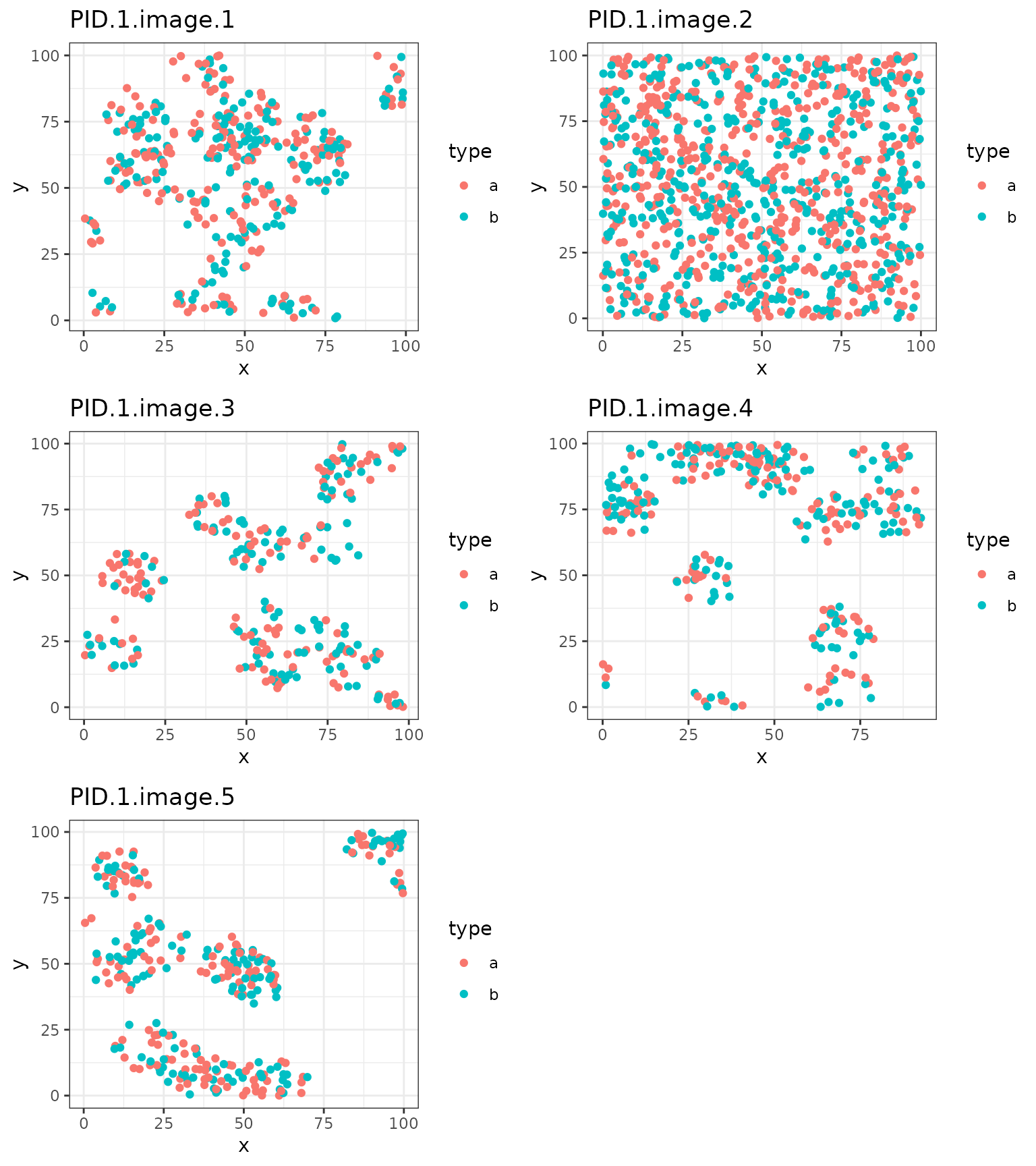 The above plots show simulated data, but illustrate a common challenge
that arises in analyzing grouped point patterns reflecting multiple ROIs
of a tissue sample: heterogeneity in the spatial clustering patterns.
Each ROI shows a different clusterig pattern among the
The above plots show simulated data, but illustrate a common challenge
that arises in analyzing grouped point patterns reflecting multiple ROIs
of a tissue sample: heterogeneity in the spatial clustering patterns.
Each ROI shows a different clusterig pattern among the a
and b cell types.
We are going to use the spatial summary statistic, Ripley’s K, to
characterize the degree of adherence to clustering, repulsion, or
complete spatial randomness in each ROI. The spagg package
the contains five approaches for handling multiple spatial summary
statistics for associative analyses. Three of these approaches are
weighted aggregations of the spatial summaries using fixed weights. The
other two are ensemble approaches which generate random weights used to
construct weighted aggregations. Within each ensemble replication, we
test for an association between the weighted aggregation and the
sample-level outcome. We then ensemble the resulting p-values for an
omnibus test.
We first start by illustrating the weighted aggregations.
Weighted Aggregations
We will first consider different approaches to averaging Ripely’s K across ROIs within a sample. Let’s start by defining some notation. Suppose for sample we have ROIs. Let be the number of cells in sample ROI . Let represent the area of sample ROI . Let represent the spatial distribution of cells evaluate at radius .
spagg contains implementations for the following three
weighted averages:
(Diggle, Lange, and Beneš (1991)), (Baddeley et al. (1993)), and (Landau, Rabe-Hesketh, and Everall (2004)) were each proposed as approaches to aggregating replicated Ripley’s K statistics. The motivation behind each of these aggregations is to weight each Ripley’s K statistic by its sampling variance. However, the sampling variance is generally difficult to write down explicitly for Ripley’s K so each method relies on an approximation. The accuracy of the approximation relies on whether the intensity of the spatial point pattern (the ratio of the number of cells divided by the image area) is consistent or varied across ROIs. If the intensity is consistent, all methods should yield similar average Ripley’s K statistics and, in turn, perform similarly-well for hypothesis testing. If the intensity is different across ROIs, and also informative in predicting the outcome, the Landau mean may perform better.
We first consider a univariate analysis where we analyze only one
cell type. We start with cell type a only and its
associations with sample-level outcomes. We estimate Ripley’s K for
on each ROI. Note this may take several seconds (up to 30 seconds) to
run.
# Set the radius
r <- 30

# Save the image IDs
ids <- unique(simdata$id)

# Initialize a data.frame to store the results for each ROI
cell.a.results <- simdata %>%
  dplyr::select(PID, id) %>%
  dplyr::distinct() %>%
  dplyr::mutate(spatial = NA,
                npoints = NA,
                area = NA)

# Iterate through the ROIs (this will take a few seconds)
for (i in 1:length(ids)) {

 # Save the ith image
 image.i <- simdata %>%
   dplyr::filter(id == ids[i]) %>%
   dplyr::select(x, y, type)

   # Convert to a point process object
   w <- spatstat.geom::convexhull.xy(image.i$x, image.i$y)
   image.i.subset <- image.i %>% dplyr::filter(type == "a")
   image.ppp <- spatstat.geom::as.ppp(image.i.subset, W = w)
   spatstat.geom::marks(image.ppp) <- image.i.subset$type

   # Compute Kest
   Ki <- spatstat.explore::Kest(image.ppp, r = 0:r)

   # Calculate the number of points
   npoints.i <- spatstat.geom::npoints(image.ppp)

   # Calculate the area
   area.i <- spatstat.geom::area(image.ppp)

   # Save the results
   cell.a.results[cell.a.results$id == ids[i],]$spatial <- Ki$iso[r+1]
   cell.a.results[cell.a.results$id == ids[i],]$npoints <- npoints.i
   cell.a.results[cell.a.results$id == ids[i],]$area <- area.i
}

# View the first few rows
head(cell.a.results)
#>   PID            id  spatial npoints     area
#> 1   1 PID.1.image.1 3402.412     206 8298.469
#> 2   1 PID.1.image.2 2779.338     538 9844.653
#> 3   1 PID.1.image.3 2623.948     134 7157.505
#> 4   1 PID.1.image.4 3382.632     151 8314.183
#> 5   1 PID.1.image.5 2911.225     157 7682.093
#> 6   2 PID.2.image.1 2374.916      62 7080.358
We can now visualize the distribution of the spatial summaries within
each image as an illustration of the variation in spatial distribution
of cells of type a across ROIs.
# Visualize the distribution of spatial summaries within each sample
cell.a.results %>%
  dplyr::mutate(PID = factor(PID)) %>%
  ggplot(aes(x = PID, y = spatial, group = PID)) +
  geom_boxplot() +
  theme_bw() +
  ggtitle("Ripley's K statistics for ROIs within a each sample") +
  ylab("Kest")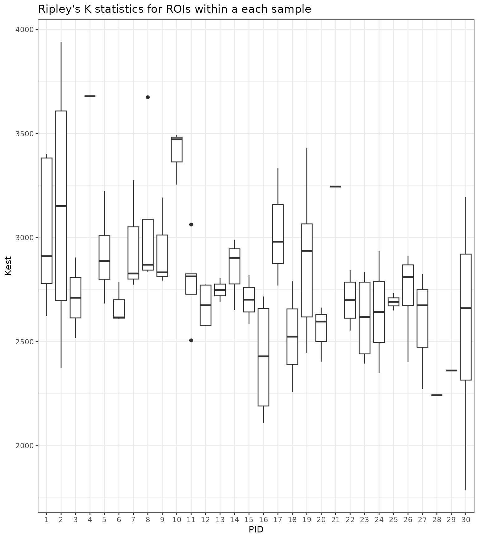
As the above plot illustrates, there can be considerable variation in the spatial summary statistic values within a single sample.
After that, we will compute the weighted averages given above. We will also compute a standard arithmetic mean as a comparison. Below, we visualize the spread of the various spatial aggregation methods within each sample. For some samples, the averages yield similar values. For others, the averages exhibit large variation, suggesting they up- or down-weight certain ROIs depending on the area of the ROI or the number of cells.
# Compute averages
cell.a.results_mean <- cell.a.results %>%
    dplyr::group_by(PID) %>%
    dplyr::summarise_at(dplyr::vars(spatial),
                        list(~mean(.x),
                             ~landau.avg(K.vec = .x, area.vec = area, n.vec = npoints),
                             ~diggle.avg(K.vec = .x, n.vec = npoints),
                             ~baddeley.avg(K.vec = .x, n.vec = npoints)))

# Plot the averages
cell.a.results_mean %>%
  tidyr::pivot_longer(2:5, names_to = "mean", values_to = "value") %>%
  dplyr::mutate(mean = recode(mean,
                              "mean" = "Arithmetic Mean",
                              "landau.avg" = "Landau Mean",
                              "diggle.avg" = "Diggle Mean",
                              "baddeley.avg" = "Baddeley Mean")) %>%
  dplyr::mutate(PID = factor(PID)) %>%
  ggplot(aes(x = PID, y = value, group = mean, color = mean)) +
  geom_point() +
  theme_bw() +
  ylab("Average Kest") +
  ggtitle("Averaged Ripley's K within each sample") +
  scale_color_discrete(name = "Aggregation Method")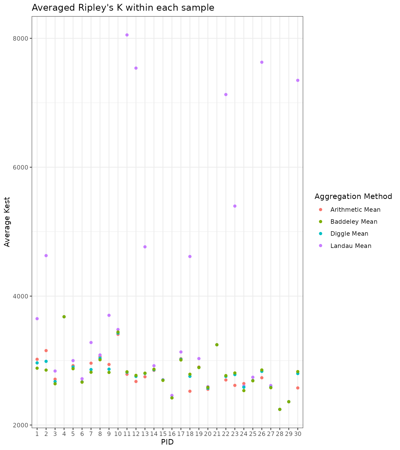
We now have a data.frame with a column corresponding to each average.
We can add in the outcome variable, out, so we can do
association testing with the aggregated Ripley’s K statistics. We would
like to compare if the aggregated Ripley’s K statistics are equal
between cases (out=1) and controls (out=0). In
other words, we would like to test if the average spatial
distribution of cells across ROIs is the same between these two
groups.
# First, check the ordering matches
all(unique(simdata$PID) == cell.a.results_mean$PID) # TRUE!
#> [1] TRUE

# Add in the outcome
cell.a.results_mean$out <- simdata %>%
  dplyr::select(PID, out) %>%
  dplyr::distinct() %>%
  dplyr::select(out) %>%
  unlist()

# Test for an association between CD4 T cell spatial distributions and MHCII-high status
mean.glm <- glm(out ~ mean, data = cell.a.results_mean, family = binomial())
diggle.glm <- glm(out ~ diggle.avg, data = cell.a.results_mean, family = binomial())
baddeley.glm <- glm(out ~ baddeley.avg, data = cell.a.results_mean, family = binomial())
landau.glm <- glm(out ~ landau.avg, data = cell.a.results_mean, family = binomial())

# Save the p-values in a table and display
cell.a.pvals <- data.frame(
  Method = c("Mean", "Diggle", "Baddeley", "Landau"),
  P.Value = c(summary(mean.glm)$coef[2,4], summary(diggle.glm)$coef[2,4],
              summary(baddeley.glm)$coef[2,4], summary(landau.glm)$coef[2,4])
)

# Show the results
cell.a.pvals
#>     Method     P.Value
#> 1     Mean 0.006060067
#> 2   Diggle 0.023752779
#> 3 Baddeley 0.040878265
#> 4   Landau 0.205325277
Using a standard mean, the Diggle method, and the Baddeley approach,
we found a significant association between the spatial distribution of
cell type a and outcomes. We did not find this association,
however, using the Landau mean.
To explore the varied performance of these methods a bit more, we can
plot the intensity of cell type a within each ROI and
examine the variation across samples, as shown below. There is
considerable variation across samples and considerable variation within
some samples. Samples 4 and 6, for example, show very little variation
across ROIs. However, Sample 4 only had 1 image. Other samples, showed
more variation, like Samples 1 and 2. The overall spread in variation,
however, was only between 0.002 and 0.05.
# Calculate intensity for each ROI and plot
cell.a.results %>%
  dplyr::mutate(intensity = npoints/area) %>%
  dplyr::mutate(PID = factor(PID)) %>%
  ggplot(aes(x = PID, y = intensity, group = PID)) +
  geom_boxplot() +
  theme_bw() +
  ggtitle("Variation in Point Pattern Intensity Within Each Sample")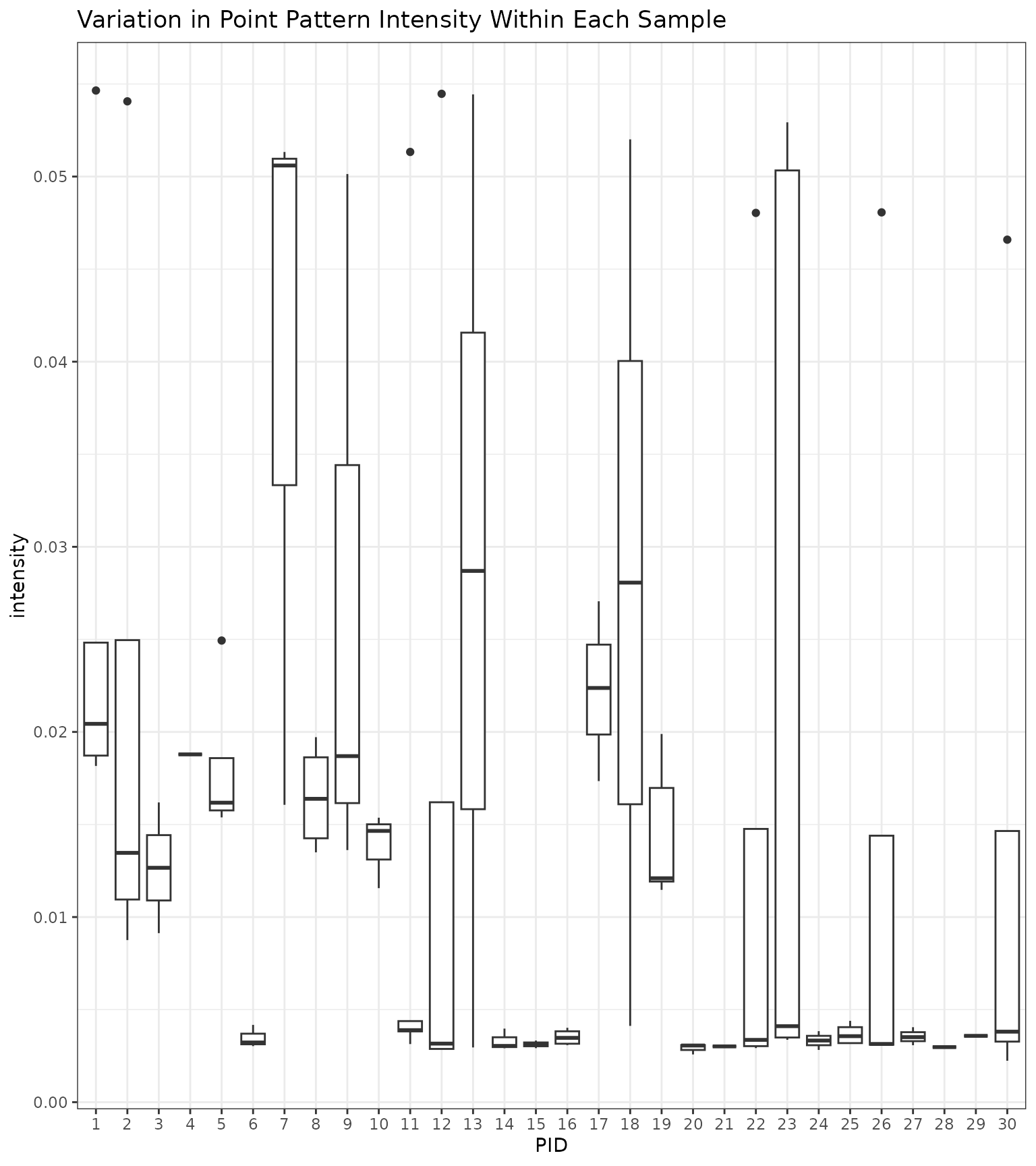
# How many ROIs did each sample have?
simdata %>% dplyr::select(PID, id) %>% dplyr::group_by(PID) %>% dplyr::summarise(n = n()) %>% head(10)
#> # A tibble: 10 × 2
#>      PID     n
#>    <int> <int>
#>  1     1  2272
#>  2     2  1570
#>  3     3   466
#>  4     4   318
#>  5     5  1098
#>  6     6   170
#>  7     7  2292
#>  8     8  1004
#>  9     9  1419
#> 10    10   702

# Calculate the range in intensity
cell.a.results %>%
  dplyr::mutate(intensity = npoints/area) %>%
  dplyr::summarise(min.intensity = min(intensity),
                   max.intensity = max(intensity))
#>   min.intensity max.intensity
#> 1   0.002237422    0.05464895
We can also examine if the intensity differed between outcomes. Below
we plot the intensities across ROIs and examine if this associates with
case (out=1) or control (out=0) status. Below,
we see that there was some variation in ROI intensity across outcomes.
Nonetheless, the Landau mean still did not perform best.
# Add in the outcome
cell.a.results$out <- simdata %>%
  dplyr::select(PID, id, out) %>%
  dplyr::distinct() %>%
  dplyr::select(out) %>%
  unlist()

# Plot
cell.a.results %>%
  dplyr::mutate(intensity = npoints/area) %>%
  dplyr::mutate(out = factor(out)) %>%
  ggplot(aes(x = out, y = intensity)) +
  geom_boxplot() +
  theme_bw() +
  ggtitle("Variation in Point Pattern Intensity Across Outcomes")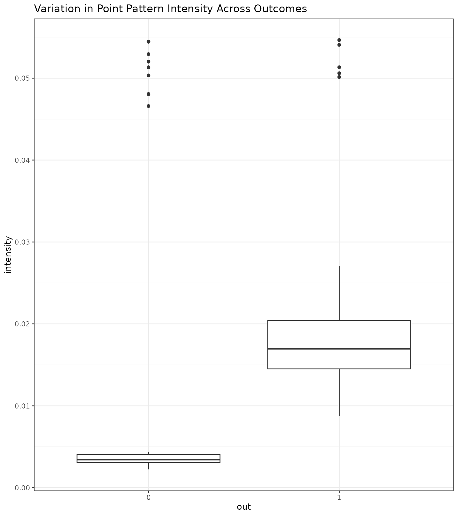
We also consider a bivariate analysis where we examine the bivariate
colocalization of cell types a and b. We
follow a similar series of steps, but instead use the
Kcross function to characterize the colocalization of these
cell types.
# Set the radius
r <- 30

# Initialize a data.frame to store the results for each ROI
cell.ab.results <- simdata %>%
  dplyr::select(PID, id) %>%
  dplyr::distinct() %>%
  dplyr::mutate(spatial = NA,
                npoints = NA,
                area = NA)

# Iterate through the ROIs (this will take a few seconds)
for (i in 1:length(ids)) {

 # Save the ith image
 image.i <- simdata %>%
   dplyr::filter(id == ids[i]) %>%
   dplyr::select(x, y, type)

   # Convert to a point process object
   w <- spatstat.geom::convexhull.xy(image.i$x, image.i$y)
   image.ppp <- spatstat.geom::as.ppp(image.i, W = w)
   spatstat.geom::marks(image.ppp) <- factor(image.i$type)

   # Compute Kest
   Ki <- spatstat.explore::Kcross(image.ppp, i = "a", j = "b", r = 0:r)

   # Calculate the number of points
   npoints.i <- spatstat.geom::npoints(image.ppp)

   # Calculate the area
   area.i <- spatstat.geom::area(image.ppp)

   # Save the results
   cell.ab.results[cell.ab.results$id == ids[i],]$spatial <- Ki$iso[r+1]
   cell.ab.results[cell.ab.results$id == ids[i],]$npoints <- npoints.i
   cell.ab.results[cell.ab.results$id == ids[i],]$area <- area.i
}

# View the first few rows
head(cell.ab.results)
#>   PID            id  spatial npoints     area
#> 1   1 PID.1.image.1 3352.665     388 8298.469
#> 2   1 PID.1.image.2 2778.717    1010 9844.653
#> 3   1 PID.1.image.3 2695.169     257 7157.505
#> 4   1 PID.1.image.4 3406.225     316 8314.183
#> 5   1 PID.1.image.5 2947.781     301 7682.093
#> 6   2 PID.2.image.1 2449.192     124 7080.358
Following the same steps as above, we will compute the averages
within each PID and test for an association with the
outcome.
# Compute averages
cell.ab.results_mean <- cell.ab.results %>%
    dplyr::group_by(PID) %>%
    dplyr::summarise_at(dplyr::vars(spatial),
                        list(~mean(.x),
                             ~landau.avg(K.vec = .x, area.vec = area, n.vec = npoints),
                             ~diggle.avg(K.vec = .x, n.vec = npoints),
                             ~baddeley.avg(K.vec = .x, n.vec = npoints)))

# First, check the ordering matches
all(unique(simdata$PID) == cell.ab.results_mean$PID) # TRUE!
#> [1] TRUE

# Add in the outcome
cell.ab.results_mean$out <- simdata %>%
  dplyr::select(PID, out) %>%
  dplyr::distinct() %>%
  dplyr::select(out) %>%
  unlist()

# Test for an association between CD4 T cell spatial distributions and MHCII-high status
mean.ab.glm <- glm(out ~ mean, data = cell.ab.results_mean, family = binomial())
diggle.ab.glm <- glm(out ~ diggle.avg, data = cell.ab.results_mean, family = binomial())
baddeley.ab.glm <- glm(out ~ baddeley.avg, data = cell.ab.results_mean, family = binomial())
landau.ab.glm <- glm(out ~ landau.avg, data = cell.ab.results_mean, family = binomial())

# Save the p-values in a table and display
cell.ab.pvals <- data.frame(
  Method = c("Mean", "Diggle", "Baddeley", "Landau"),
  P.Value = c(summary(mean.ab.glm)$coef[2,4], summary(diggle.ab.glm)$coef[2,4],
              summary(baddeley.ab.glm)$coef[2,4], summary(baddeley.ab.glm)$coef[2,4])
)

# Show the results
cell.ab.pvals
#>     Method    P.Value
#> 1     Mean 0.02393126
#> 2   Diggle 0.01362797
#> 3 Baddeley 0.05261129
#> 4   Landau 0.05261129
Here we found a significant association between the spatial
colocalization of cell types a and b with
outcomes using a standard arithmetic mean and using the Diggle mean but
not using the Baddeley or Landau mean.
Ensemble Approaches
We now illustrate using ensemble testing to test the same hypothesis,
whether the spatial distribution of cells is equal between cases
(out=1) and controls (out=0). These ensemble
approaches consider multiple random weights used to construct the
aggregations of the spatial summary statistics. For each set of random
weights, we test for an association between the weighted aggregation and
outcome. We repeat this for many random weights and combine the
resulting p-values using a p-value combination method. For this purpose,
we use the Cauchy combination test (Liu and Xie
(2020)).
The motivation behind these ensemble approaches is that the best set of weights (the weights that will yield the highest power) is generally unknown at the outset. For this reason, considering many different possible weights may gain us more power because we may capture the true relationship between the aggregated spatial summary statistics and sample-level outcome through randomly simulating weights.
spagg contains implementations for two different
approaches:
: in this approach,
spaggrandomly generates weights from a standard normal distribution which are used to construct a weighted mean of the Ripley’s K estimates obtained from each ROI. This process is repeated many times. For each random set of weights, the association between the weighted mean spatial summary and sample-level outcomes is tested. The resulting p-values are combined using the Cauchy combination test. This approach is contained in theensemble.avgfunction.: in this approach,
spaggrandomly generates weights from a standard normal distribution and uses these weights as well as the number of cells in each ROI to construct a weighted mean of Ripley’s K estimates. This process is repeated many times and the resulting p-values are combined using the Cauchy combination test. This approach is contained in thecombo.weight.avgfunction.
We now run these approaches to testing for the univariate analysis
using the cell.a.results data.frame we constructed above
which contains the Ripley’s K value at r=30.
# Run each ensemble test
ensemble.res <- ensemble.avg(data = cell.a.results,
                             group = "PID",
                             outcome = "out",
                             model = "logistic")

combo.res <- combo.weight.avg(data = cell.a.results,
                              group = "PID",
                              outcome = "out",
                              model = "logistic")

# Add the p-values to the results above
cell.a.pvals <- rbind.data.frame(
  cell.a.pvals,
  data.frame(
    Method = c("Ensemble", "Combo"),
    P.Value = c(ensemble.res$pval, combo.res$pval)
  )
)

# Print the results
cell.a.pvals
#>     Method     P.Value
#> 1     Mean 0.006060067
#> 2   Diggle 0.023752779
#> 3 Baddeley 0.040878265
#> 4   Landau 0.205325277
#> 5 Ensemble 0.009344770
#> 6    Combo 0.020319545
Here, the mean and the ensemble approaches yielded the lowest
p-values. The combo approach also yielded a low p-value. This suggests
some concordance among the methods in detecting a significant
association between the spatial distribution of cell type a
and case/control status.
We can also perform ensemble testing for the bivariate case. We show
how to do this below using the cell.ab.results object.
# Add the outcome back into the data
cell.ab.results <- left_join(cell.ab.results,
                     simdata %>% dplyr::select(id, PID, out) %>% distinct(),
                     by = c("id", "PID"))

# Run each ensemble test
ensemble.res <- ensemble.avg(data = cell.ab.results, group = "PID",
                             outcome = "out", model = "logistic")

combo.res <- combo.weight.avg(data = cell.ab.results, group = "PID",
                              outcome = "out", model = "logistic")
#> Warning: glm.fit: fitted probabilities numerically 0 or 1 occurred
#> Warning: glm.fit: fitted probabilities numerically 0 or 1 occurred
#> Warning: glm.fit: fitted probabilities numerically 0 or 1 occurred
#> Warning: glm.fit: fitted probabilities numerically 0 or 1 occurred
#> Warning: glm.fit: fitted probabilities numerically 0 or 1 occurred
#> Warning: glm.fit: fitted probabilities numerically 0 or 1 occurred
#> Warning: glm.fit: fitted probabilities numerically 0 or 1 occurred
#> Warning: glm.fit: fitted probabilities numerically 0 or 1 occurred
#> Warning: glm.fit: fitted probabilities numerically 0 or 1 occurred
#> Warning: glm.fit: fitted probabilities numerically 0 or 1 occurred
#> Warning: glm.fit: fitted probabilities numerically 0 or 1 occurred
#> Warning: glm.fit: fitted probabilities numerically 0 or 1 occurred
#> Warning: glm.fit: fitted probabilities numerically 0 or 1 occurred
#> Warning: glm.fit: fitted probabilities numerically 0 or 1 occurred
#> Warning: glm.fit: fitted probabilities numerically 0 or 1 occurred
#> Warning: glm.fit: fitted probabilities numerically 0 or 1 occurred
#> Warning: glm.fit: fitted probabilities numerically 0 or 1 occurred
#> Warning: glm.fit: fitted probabilities numerically 0 or 1 occurred
#> Warning: glm.fit: fitted probabilities numerically 0 or 1 occurred
#> Warning: glm.fit: fitted probabilities numerically 0 or 1 occurred
#> Warning: glm.fit: fitted probabilities numerically 0 or 1 occurred
#> Warning: glm.fit: fitted probabilities numerically 0 or 1 occurred
#> Warning: glm.fit: fitted probabilities numerically 0 or 1 occurred
#> Warning: glm.fit: fitted probabilities numerically 0 or 1 occurred
#> Warning: glm.fit: fitted probabilities numerically 0 or 1 occurred
#> Warning: glm.fit: fitted probabilities numerically 0 or 1 occurred
#> Warning: glm.fit: fitted probabilities numerically 0 or 1 occurred
#> Warning: glm.fit: fitted probabilities numerically 0 or 1 occurred

# Add the p-values to the results above
cell.ab.pvals <- rbind.data.frame(
  cell.ab.pvals,
  data.frame(
    Method = c("Ensemble", "Combo"),
    P.Value = c(ensemble.res$pval, combo.res$pval)
  )
)

# Print the results
cell.ab.pvals
#>     Method    P.Value
#> 1     Mean 0.02393126
#> 2   Diggle 0.01362797
#> 3 Baddeley 0.05261129
#> 4   Landau 0.05261129
#> 5 Ensemble 0.02104012
#> 6    Combo 0.02473175
Here, the ensemble and combo approaches yielded low p-values,
suggesting the spatial colocalization of cell types a and
b is associated with the outcome.