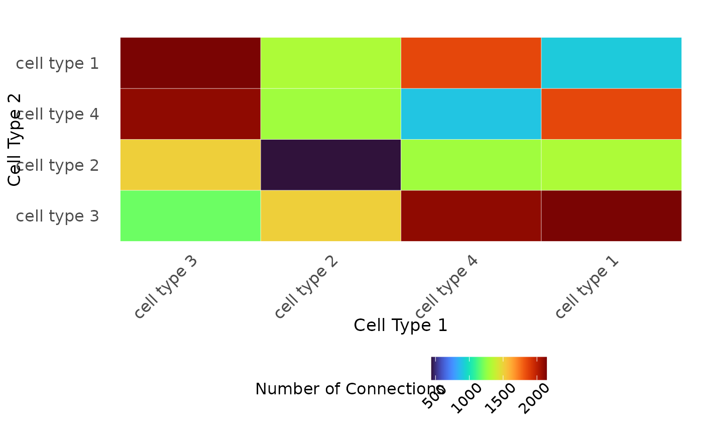
Visualize the connectivity matrix produced by generate_connectivity
Usage
plot_cell_connections(image, threshold, title, type.column, unique.types)
Arguments
- image
A data.frame containing the image information.
- threshold
Radius to plot, usually threshold generated by scale_importance
- title
Plot title
- type.column
The name of the column in images.df that contains the cell types
- unique.types
Vector of unique cell types in the type.column
Value
Returns a ggplot of the heatmap of cell-cell connections.
Examples
require(magrittr)
plot_cell_connections(
   image = data1.df %>% dplyr::filter(PID == 1),
   threshold = 10,
   title = "",
   type.column = "type",
   unique.types = unique(data1.df$type)
)