TopKAT
TopKAT.RmdIntroduction
In this vignette, we illustrate how to apply the TopKAT
method to analyze cell-level imaging data.
The motivation behind TopKAT is the analysis of
multiplexed spatial proteomics imaging in which the phenotype and
locations of cells is derived based on the spatial proteome. The goal is
to examine the association between the geometry of cells in these images
with patient-level outcomes.
This vignette will rely on simulated point pattern data that includes contrived shapes, namely squares and circles.
Loading in the Data and Plotting
We start by loading in the packages we will need in this vignette and our simulated data.
# Packages
library(TopKAT)
#> Registered S3 method overwritten by 'httr':
#>   method         from
#>   print.response rmutil
library(patchwork)
library(survival)
library(survminer)
#> Loading required package: ggplot2
#> Loading required package: ggpubr
#>
#> Attaching package: 'survminer'
#> The following object is masked from 'package:survival':
#>
#>     myeloma

# Load data
data(data1.df)

# View the first few lines
head(data1.df)
#>   PID id        x       y        type
#> 1   1  1 41.48928 16.3068 cell type 3
#> 2   1  1 42.48928 16.3068 cell type 2
#> 3   1  1 43.48928 16.3068 cell type 2
#> 4   1  1 44.48928 16.3068 cell type 4
#> 5   1  1 45.48928 16.3068 cell type 3
#> 6   1  1 46.48928 16.3068 cell type 3
The data is organized so that each row corresponds to a cell within
each image. The PID column refers to the sample or patient
ID which, in this case, enumerates from 1 to
100. The id column enumerates the image number
within the sample since in many applications we have multiple images per
patient. In this case, the PID and id columns
are the same because we simulated a single image for each sample. The
x and y columns denote the 2D coordinates of
the cell locations. The type column contains a simulated
type for each cell, ranging from cell type 1 to
cell type 4.
To simulate this data, we split the 100 samples into two groups of 50. For the first 50 samples, we generated random numbers of squares. For the latter 50, we generated random numbers of loops. For these two groups, we also simulated different survival outcomes. The outcomes were simulated from an exponential distribution with rates equal to and , respectively. We randomly censored 10% of samples.
We plot a handful of images to get a sense of the various shapes of cells. It is apparent that these images exhibit contrived shapes generated by the cells: in the top row of images, the cells are organized in squares whereas in the second row the cells are organized in loops. This was intentional in order to illustrate the process of detecting large connected components among the cells (squares, as in the first image) or large loops.
# Plotting some images from the first 50
p1 <- data1.df %>% dplyr::filter(PID == 1) %>%
  ggplot(aes(x = x, y = y, colour = type)) + geom_point() +
  theme_bw() + ggtitle("Sample 1") +
  theme(legend.position = )

p2 <- data1.df %>% dplyr::filter(PID == 2) %>%
  ggplot(aes(x = x, y = y, colour = type)) + geom_point() +
  theme_bw() + ggtitle("Sample 2")

p3 <- data1.df %>% dplyr::filter(PID == 51) %>%
  ggplot(aes(x = x, y = y, colour = type)) + geom_point() +
  theme_bw() + ggtitle("Sample 51")

p4 <- data1.df %>% dplyr::filter(PID == 52) %>%
  ggplot(aes(x = x, y = y, colour = type)) + geom_point() +
  theme_bw() + ggtitle("Sample 52")

# Arrange the plots
(p1 + p2 + p3 + p4 & theme(legend.position = "bottom")) + plot_layout(guides = "collect")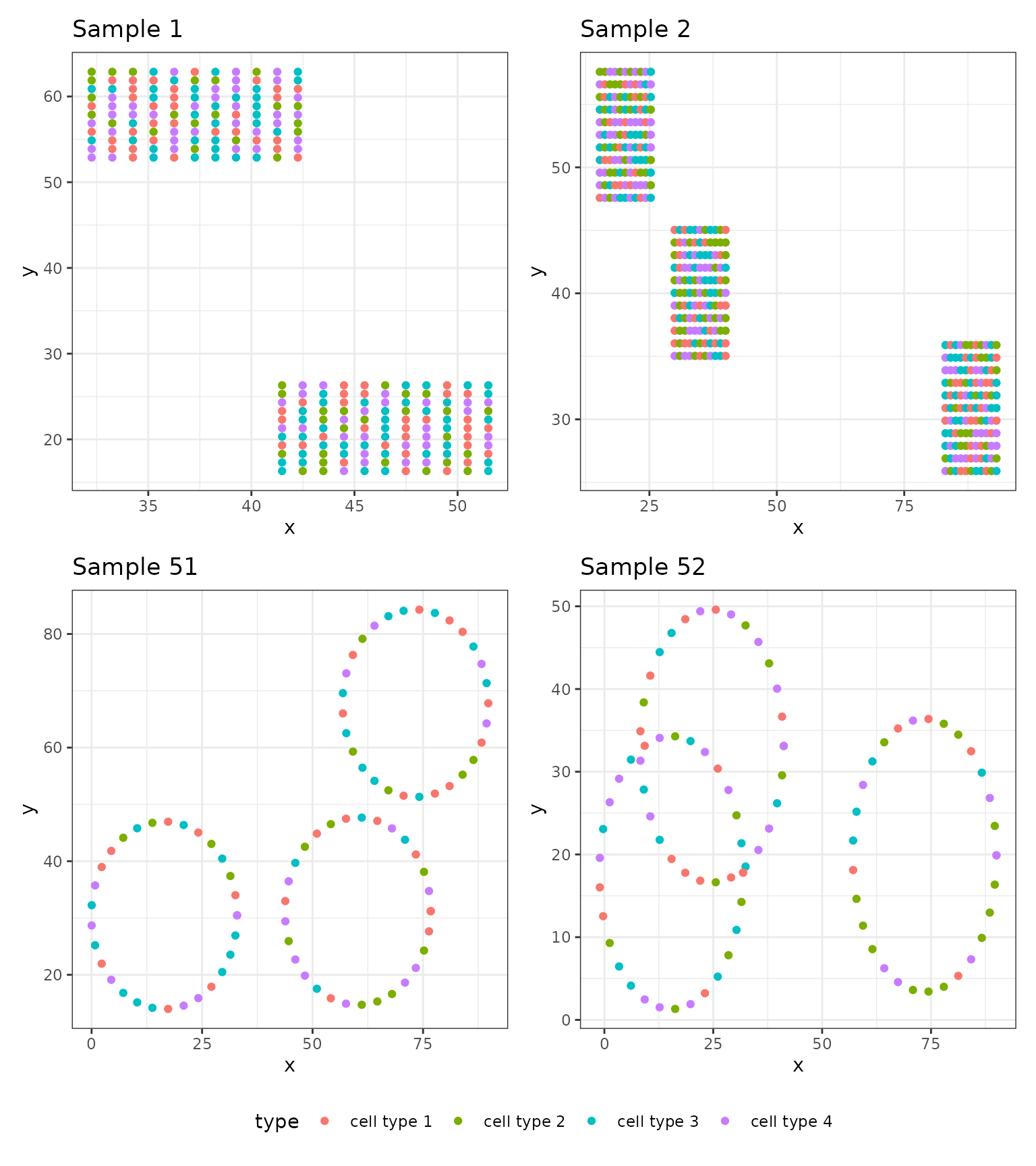
Applying TopKAT
The goal of TopKAT is to test whether images with similar geometric structures created by cells correspond to patients with similar outcomes (in this case, survival). The null and alternative hypotheses for this test are:
: There is no association between survival time and topological structure of cells
: There is an association between survival time and topological structure of cells
If the TopKAT p-value is small, this is evidence against .
To apply TopKAT, we first need to (1) quantify the geometric arrangement of cells in each image using persistent homology and (2) calculate the similarity in geometric arrangements across images. The geometric structures we will quantify are connected components (degree-0 homologies) and loops (degree-1 homologies). TopKAT compares images based on similarities in the quantity and size (i.e., lifespan) of these homologies. In other words, if two images have a similar number of connected components or loops and these shapes are also of similar sizes, they will be more similar than two images with differences in either of these attributes.
To detect and quantify the size these homologies, we use a summary statistic known as a persistence diagram. The persistence diagram summarizes the number and size of connected components and loops. We will illustrate examples of persistence diagrams below.
The first step in using the TopKAT package is to
calculate the kernel matrices which quantify the similarity between
images. We will use the function rips_similarity_matrix to
compute the kernel matrices. Note that we compute a separate kernel
matrix for connected components and loops, meaning we first compare the
images on the basis of connected components and then on the basis of
loops, yielding two matrices quantifying the pairwise similarities among
the images. Later, in our kernel association test, we will aggregate
across both matrices to yield an omnibus test of association.
Below, we show how to calculate the kernel matrices using
rips_similarity_matrix using a maximum distance of
.
We chose this maximum distance since the images are of dimension
and
is rounded up from
,
the diagonal of the images. There is no penalty for selecting a distance
that exceeds the boundaries of the image. The quantification of
persistent homology stops once all the cells are connected. Note that
this may take up to several minutes to run, depending on the number of
cells in each image.
# Compute the similarity matrix
simmat <- rips_similarity_matrix(data1.df, max.threshold = 142, print.progress = FALSE)
rips_similarity_matrix returns two lists: (1)
K.list which contains the two kernel matrices for the
connected components and the loops and (2) rips.list which
contains the persistence diagram for each image.
We illustrate here two visualizations. First, we visualize the corresponding persistence diagrams for the four samples shown above.
# Plotting the persistence diagrams
pd1 <- plot_persistence(simmat$rips.list[[1]], title = "Patient 1")

pd2 <- plot_persistence(simmat$rips.list[[2]], title = "Patient 2")

pd3 <- plot_persistence(simmat$rips.list[[51]], title = "Patient 51")

pd4 <- plot_persistence(simmat$rips.list[[52]], title = "Patient 52")

# Arrange the plots
(pd1 + pd2 + pd3 + pd4 & theme(legend.position = "bottom")) + plot_layout(guides = "collect")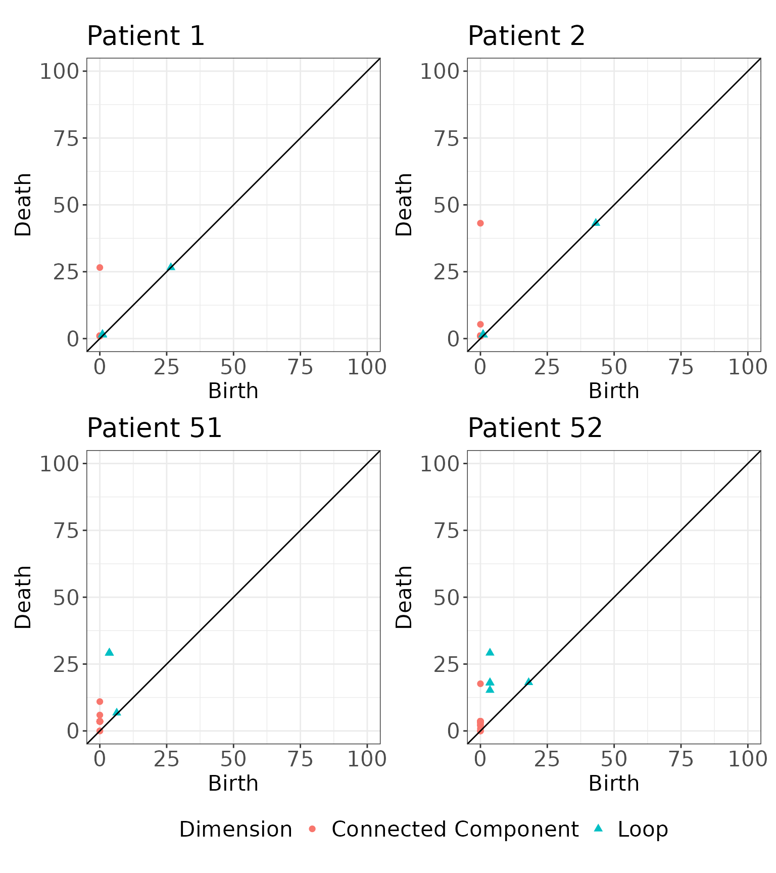
We also show a visualization of the kernel matrices to describe the similarities among the images. Note that the similarity values in the kernel matrices are not interpretable on their own and can only be used to compare the similarities between two pairs of images.
# Visualize the kernel matrices for the connected components
K.cc <- simmat$K.list[[1]] %>%
  reshape2::melt() %>%
  ggplot(aes(x = Var1, y = Var2, fill = value)) +
  geom_tile(color = "white") +
  theme_bw() +
  xlab("Image 1") + ylab("Image 2") +
  ggtitle("Kernel Matrix for Connected Components") +
  theme(legend.text = element_text(angle = 45, hjust = 1))


# Visualize the kernel matrices for the loops
K.loop <- simmat$K.list[[2]] %>%
  reshape2::melt() %>%
  ggplot(aes(x = Var1, y = Var2, fill = value)) +
  geom_tile(color = "white") +
  theme_bw() +
  xlab("Image 1") + ylab("Image 2") +
  ggtitle("Kernel Matrix for Loops") +
  theme(legend.text = element_text(angle = 45, hjust = 1))

# Arrange the plots
K.cc + K.loop & theme(legend.position = "bottom")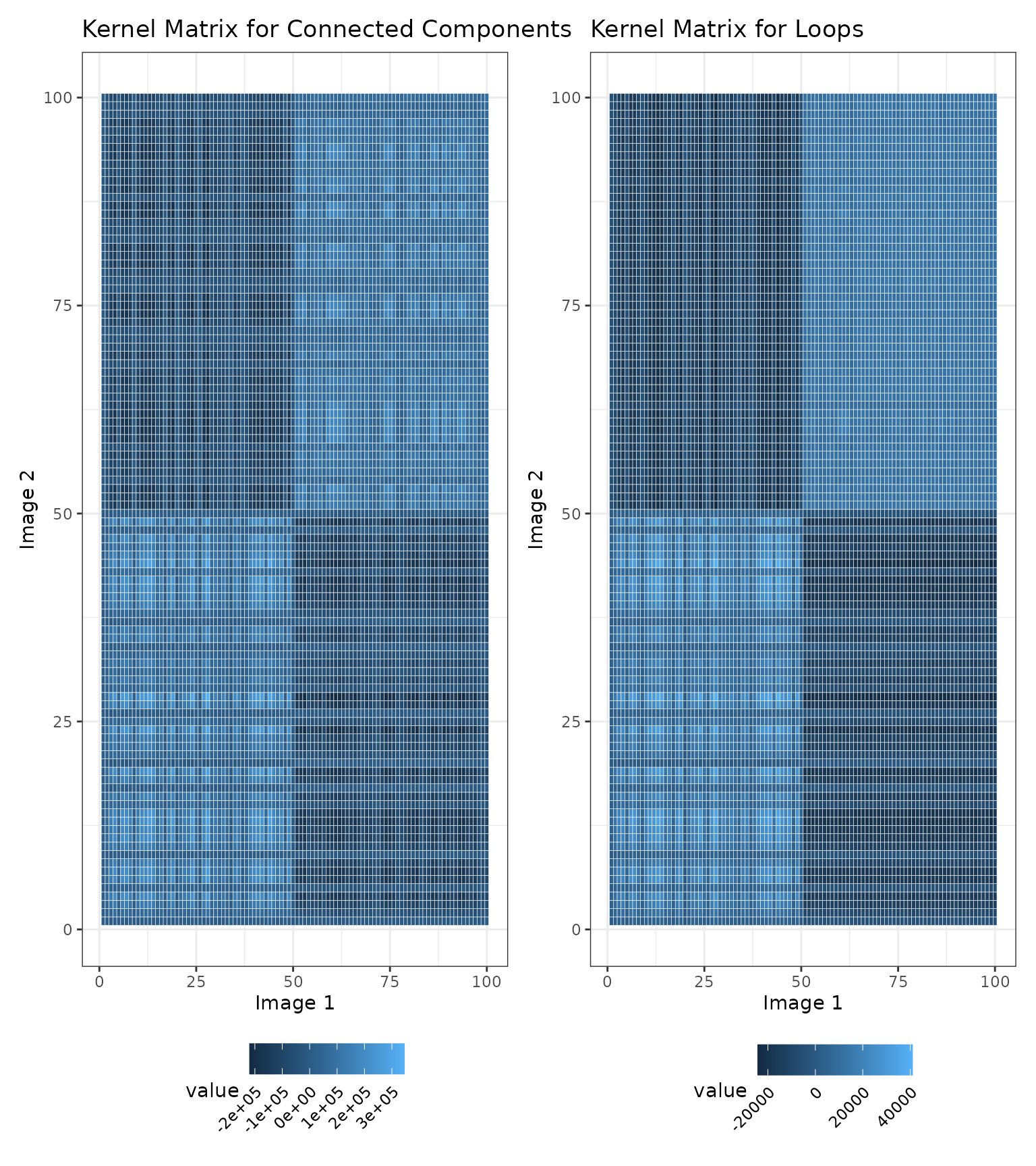
Finally, we can test for an association with survival given the kernel matrices we computed above. Since we have two kernel matrices, we may want to aggregate our association results across both homologies. We will construct a linear combination of the kernel matrices and aggregate results across different mixtures. A straightforward choice of weights is in the following linear combination:
We now apply TopKAT. As shown below, the TopKAT p-value is significant, .
# Applying TopKAT to the simulated data
res <- TopKAT(y = y, X = NULL, cens = cens,
              K.list = simmat$K.list, omega.list = c(0, 0.5, 1),
              outcome.type = "survival")

# Output the p-value
res$overall.pval
#> [1] 3.443675e-05
We can also examine how significant the results are for each linear combination of kernel matrices:
res$p.vals
#>      omega.0    omega.0.5      omega.1
#> 1.107707e-04 3.650099e-05 1.972696e-05
Descriptive Post-Hoc Analyses
So far, we have shown that there is a significant association between the geometric arrangements of cells in the images and survival. We can now explore which distances are most ``important” (i.e., significantly associated with the outcome) and assess which cell types are connected at this distance.
To do this, we use the scale_importance function. Given
a sequence of distances, this function iteratively runs
TopKAT, on a thresholded version of the persistence
diagrams at each distance value. To illustrate this process, consider
the following image and corresponding persistence diagram:
# Plot image and persistence diagram side-by-side
p3 + pd3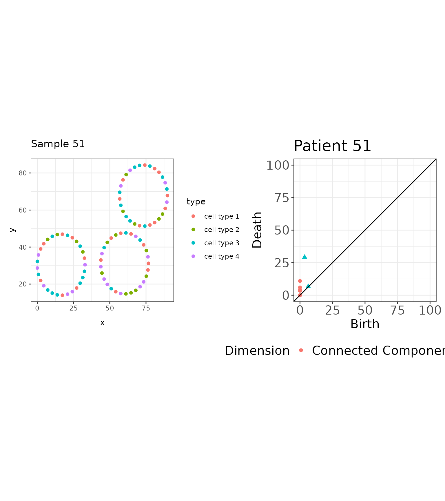
# View the birth/death distances for the loops
tail(simmat$rips.list[[51]])
#>       dimension    birth     death
#> [87,]         0 0.000000  5.937082
#> [88,]         0 0.000000 10.961621
#> [89,]         1 6.321171  6.750254
#> [90,]         1 3.567928 29.155897
#> [91,]         1 3.567928 29.155897
#> [92,]         1 3.567928 29.155897
This image exhibits three loops of equal diameter, units. Looking at the birth and death scales associated with the loops in this image, three loops were born at and died at . For a sequence of distances, , we threshold the persistence diagram to features that were born and died by distance , as illustrated below:
# Save the corresponding persistence diagram
pd <- as.data.frame(simmat$rips.list[[51]])
# Threshold at t = 5
pd3.1 <- plot_persistence(pd %>% dplyr::filter(birth <= 5 & death <= 5),
title = "Patient 51 \n Threshold at t=5",
dims = c(15, 15))
# Threshold at t=10
pd3.2 <- plot_persistence(pd %>% dplyr::filter(birth <= 10 & death <= 10),
title = "Patient 51 \n Threshold at t=10",
dims = c(15, 15))
# Threshold at t=15
pd3.3 <- plot_persistence(pd %>% dplyr::filter(birth <= 15 & death <= 15),
title = "Patient 51 \n Threshold at t=15",
dims = c(15, 15))
# Threshold at t=20
pd3.4 <- plot_persistence(pd %>% dplyr::filter(birth <= 20 & death <= 20),
title = "Patient 51 \n Threshold at t=20",
dims = c(15, 15))
# Arrange
(pd3.1 + pd3.2 + pd3.3 + pd3.4 & theme(legend.position = "bottom")) + plot_layout(guides = "collect")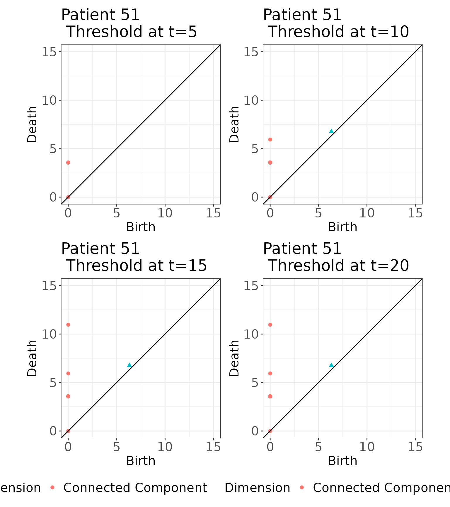 We threshold each persistence diagram at
.
We then apply TopKAT to the thresholded diagrams, calculating the
similarity between persistence diagrams and testing for an association
with the outcome. The resulting p-value for each distance is stored and
we will then examine the connections among the cells at the distance
which yields the minimum p-value. We set the maximum distance
(
We threshold each persistence diagram at
.
We then apply TopKAT to the thresholded diagrams, calculating the
similarity between persistence diagrams and testing for an association
with the outcome. The resulting p-value for each distance is stored and
we will then examine the connections among the cells at the distance
which yields the minimum p-value. We set the maximum distance
(threshold) and the function will select a sequence of
distances between
and threshold to run TopKAT at. The default is to select
distances.
res_scale_import <- scale_importance(pd.list = simmat$rips.list,
                                     y = y, cens = cens,
                                     omega.list = c(0, 0.5, 1),
                                     threshold = 100,
                                     PIDs = 1:100,
                                     outcome.type = "survival")
We first examine the sequence of p-values at each distance The distance at which the minimum TopKAT p-value arose was .
# Create a data.frame
res_scale_import.df <- data.frame(
  thresh = res_scale_import$threshold.seq,
  pval = res_scale_import$pvals
)

# Plot
res_scale_import.df %>%
  ggplot(aes(x = thresh, y = pval)) +
  geom_point() +
  theme_bw() +
  xlab("Distance") + ylab("P-Value") +
  ggtitle("TopKAT Significance at each Distance") +
geom_vline(xintercept = res_scale_import$min.thresh, linetype = "dashed") 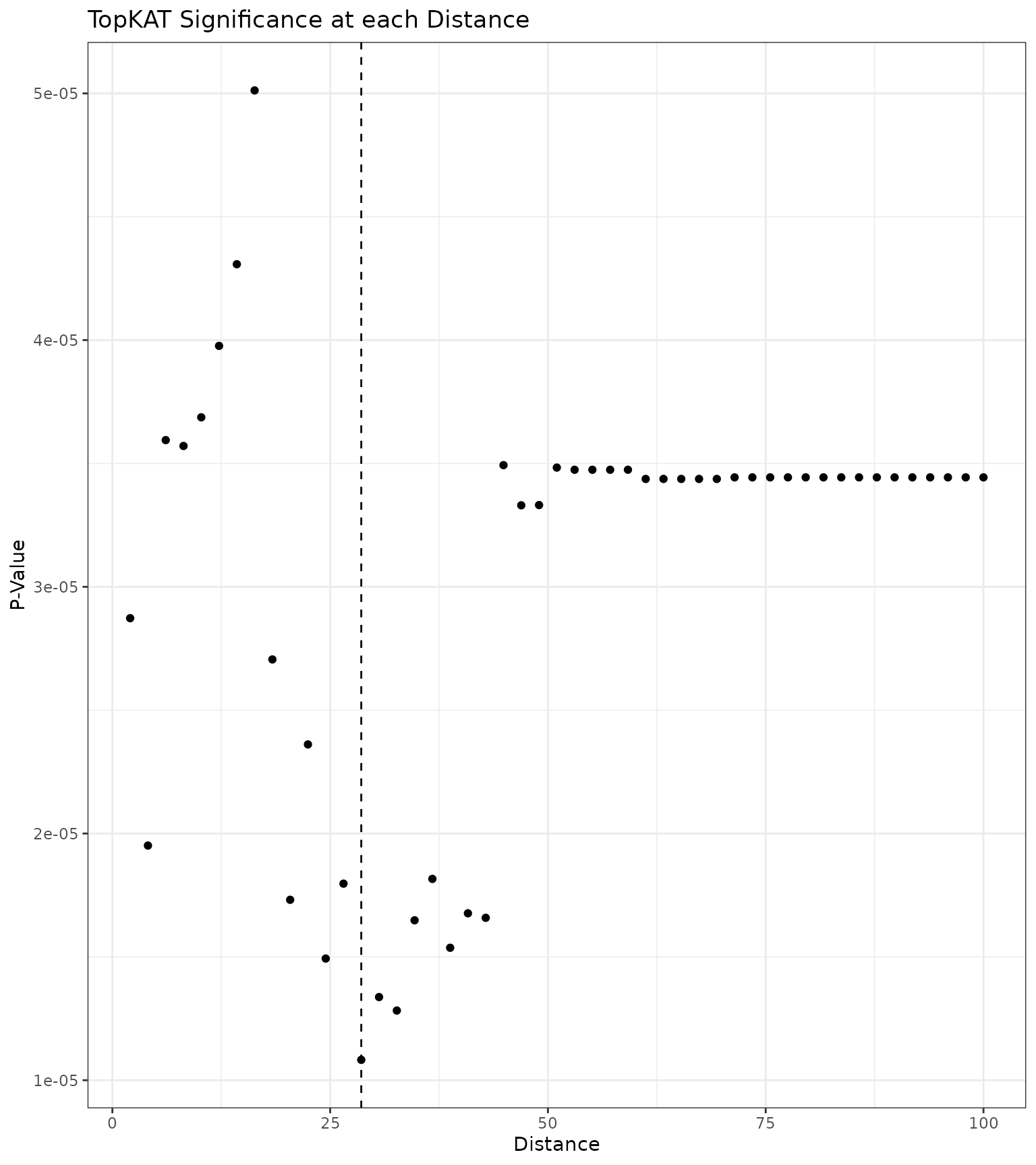
We can also examine what the simplicial complex at this distance looks like for our example images:
# Plot the simplicial complex at r=res_scale_import$min.thresh
sc1 <- plot_cells_with_scale(
  image = data1.df %>% dplyr::filter(PID == 1),
  threshold = res_scale_import$min.thresh,
  title = "Simplicial Complex for \n Sample 1"
)

sc2 <- plot_cells_with_scale(
  image = data1.df %>% dplyr::filter(PID == 2),
  threshold = res_scale_import$min.thresh,
  title = "Simplicial Complex for \n Sample 2"
)

sc3 <- plot_cells_with_scale(
  image = data1.df %>% dplyr::filter(PID == 51),
  threshold = res_scale_import$min.thresh,
  title = "Simplicial Complex for \n Sample 51"
)

sc4 <- plot_cells_with_scale(
  image = data1.df %>% dplyr::filter(PID == 52),
  threshold = res_scale_import$min.thresh,
  title = "Simplicial Complex for \n Sample 52"
)

# Arrange the plots
sc1 + sc2 + sc3 + sc4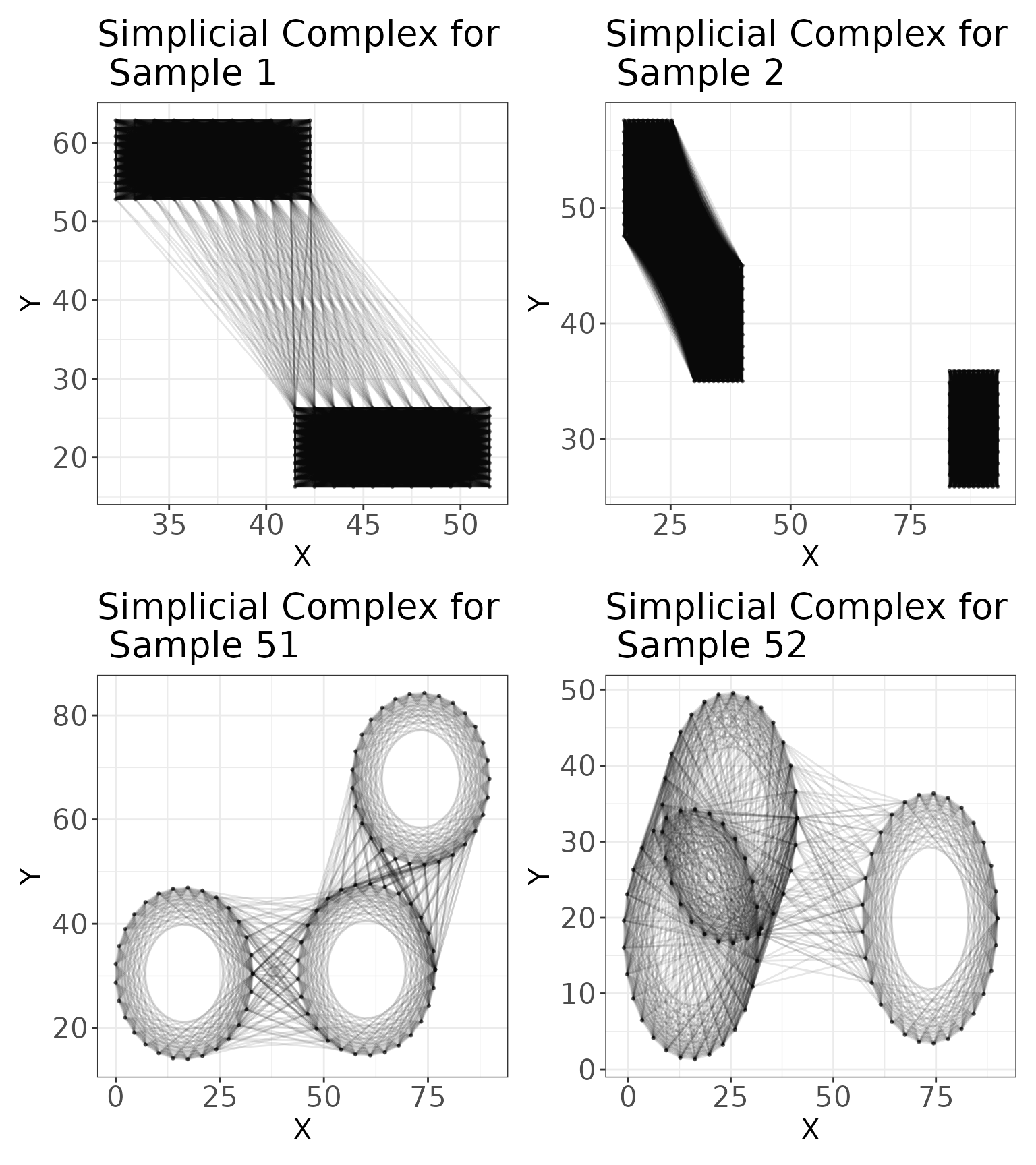
Finally, we can examine the connectivity of the cell types at this distance using connectivity matrices. These matrices enumerate how many connections there are between cells at . We visualize these matrices for the four samples given above.
# Connectivity matrices
c1 <- plot_cell_connections(
  image = data1.df %>% dplyr::filter(PID == 1),
  threshold = res_scale_import$min.thresh,
  title = "Cell Connectivity for Patient 1",
  type.column = "type",
  unique.types = unique(data1.df$type)
)

c2 <- plot_cell_connections(
  image = data1.df %>% dplyr::filter(PID == 2),
  threshold = res_scale_import$min.thresh,
  title = "Cell Connectivity for Patient 2",
  type.column = "type",
  unique.types = unique(data1.df$type)
)

c3 <- plot_cell_connections(
  image = data1.df %>% dplyr::filter(PID == 51),
  threshold = res_scale_import$min.thresh,
  title = "Cell Connectivity for Patient 51",
  type.column = "type",
  unique.types = unique(data1.df$type)
)

c4 <- plot_cell_connections(
  image = data1.df %>% dplyr::filter(PID == 52),
  threshold = res_scale_import$min.thresh,
  title = "Cell Connectivity for Patient 52",
  type.column = "type",
  unique.types = unique(data1.df$type)
)

# Arrange the plots
c1 + c2 + c3 + c4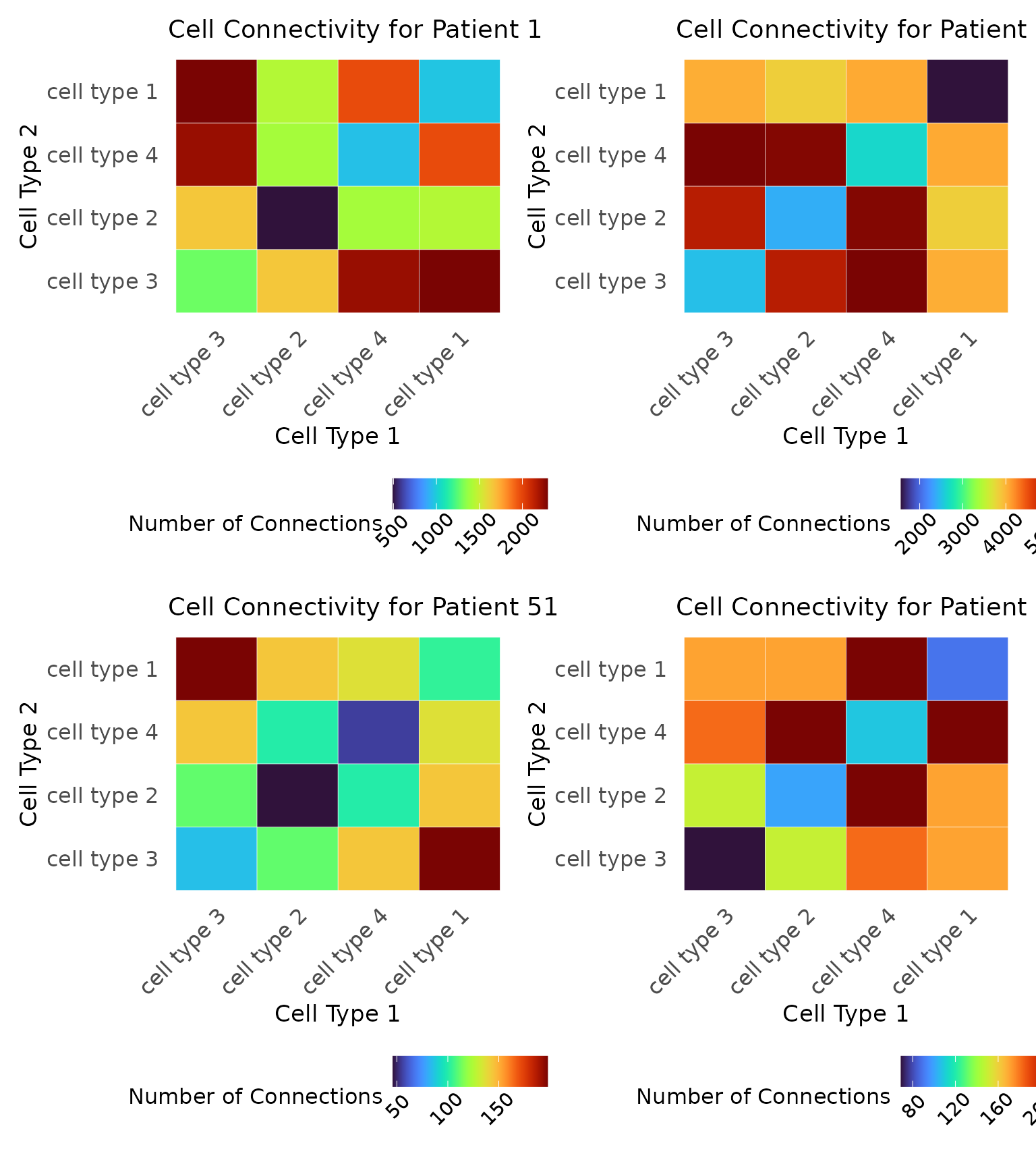
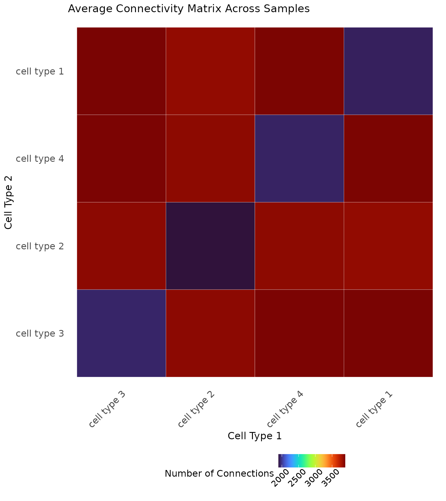
It can also be illustrative to compute an average connectivity matrix across the whole cohort or within known patient samples, as shown below.
# Save the cell types
cell.types <- as.character(unique(data1.df$type))

# Connectivity matrix for mixed and segregated
connect <- matrix(0, nrow = length(cell.types), ncol = length(cell.types),
                     dimnames = list(cell.types, cell.types))

# Iterate through the samples
for (i in 1:100) {

  # Save the data
  patient <- data1.df %>% dplyr::filter(PID == i)

  # Plot the scale importance
  connect.i <- generate_connectivity(images.df = patient,
                                     threshold = res_scale_import$min.thresh,
                                     type.column = "type",
                                     unique.types = cell.types)

  # Match the rows and columns in case an image was missing a cell type
  match.rows <- match(rownames(connect.i), cell.types)
  match.cols <- match(colnames(connect.i), cell.types)

  # Add to the matrix
  connect[match.rows, match.cols] <- connect[match.rows, match.cols] + connect.i

}

# Take the average
connect <- connect/100

# Visualize
ggplot(reshape2::melt(connect), aes(Var1, Var2, fill = value)) +
    ggplot2::geom_tile(colour = "white") +
    viridis::scale_fill_viridis(option = "turbo") +
    ggplot2::labs(x = "Cell Type 1", y = "Cell Type 2", fill = "Number of Connections") +
    ggplot2::theme_minimal() +
    ggplot2::theme(axis.text.x = element_text(size = 12, angle = 45, hjust = 1),
          axis.text.y = element_text(size = 12),
          axis.title = element_text(size = 13),
          panel.grid.major = element_blank(),
          panel.grid.minor = element_blank(),
          legend.position = "bottom",
          legend.title = element_text(size = 12),
          legend.text = element_text(size = 11, angle = 45, hjust = 0.75),
          plot.title = element_text(size = 14)) +
    ggplot2::ggtitle("Average Connectivity Matrix Across Samples")