Applying TopKAT to Simulated Tissue Data
example_sim_tissue.RmdIntroduction
In this vignette, we illustrate how to apply the TopKAT
method to analyze cell-level imaging data. We simulated this data using
the scSpatialSIM package (Soupir et
al. 2024) to provide a more realistic example of applying
TopKAT to imaging data with cell-level resolution.
Loading in the Data and Plotting
We start by loading in the packages we will need in this vignette and our simulated data.
library(TopKAT)
#> Registered S3 method overwritten by 'httr':
#>   method         from
#>   print.response rmutil
library(patchwork)
library(survival)
library(survminer)
#> Loading required package: ggplot2
#> Loading required package: ggpubr
#>
#> Attaching package: 'survminer'
#> The following object is masked from 'package:survival':
#>
#>     myeloma

# Load data
data(data2.df)

# View the first few lines
head(data2.df)
#>   PID id        x         y        type
#> 1   1  1 54.39235 99.700192 cell type 2
#> 2   1  1 16.21411 56.966352 cell type 3
#> 3   1  1 70.50213  2.342483 cell type 4
#> 4   1  1 93.95205 19.413240 cell type 4
#> 5   1  1 70.82572  7.031758 cell type 1
#> 6   1  1 88.23047 37.269243 cell type 3
The data is organized in a similar manner as the simulated dataset
used in the Getting Started vignette. The PID
column refers to the sample or patient ID which, in this case,
enumerates from 1 to 100. The id
column enumerates the image number within the sample since in many
applications we have multiple images per patient. In this case, the
PID and id columns are the same because we
simulated a single image for each sample. The x and
y columns denote the 2D coordinates of the cell locations.
The type column contains a simulated type for each cell,
ranging from cell type 1 to cell type 4.
To simulate this data, we split the 100 samples into two groups of
50. We simulated 50 datasets from the scSpatialSIM package
using the same set of parameters. We simulated two tissue types. We then
split these two tissue types into the two groups. The outcomes were
simulated as described in the Getting Started vignette – we
simulated from an exponential distribution with rates equal to
and
,
respectively. We randomly censored 10% of samples.
We plot the a handful of images here to illustrate the spatial patterns among the cells.
# Plotting some images from the first 50
p1 <- data2.df %>% dplyr::filter(PID == 1) %>%
ggplot(aes(x = x, y = y, colour = type)) + geom_point() +
theme_bw() + ggtitle("Sample 1") +
theme(legend.position = )
p2 <- data2.df %>% dplyr::filter(PID == 2) %>%
ggplot(aes(x = x, y = y, colour = type)) + geom_point() +
theme_bw() + ggtitle("Sample 2")
p3 <- data2.df %>% dplyr::filter(PID == 51) %>%
ggplot(aes(x = x, y = y, colour = type)) + geom_point() +
theme_bw() + ggtitle("Sample 51")
p4 <- data2.df %>% dplyr::filter(PID == 52) %>%
ggplot(aes(x = x, y = y, colour = type)) + geom_point() +
theme_bw() + ggtitle("Sample 52")
# Arrange the plots
(p1 + p2 + p3 + p4 & theme(legend.position = "bottom")) + plot_layout(guides = "collect")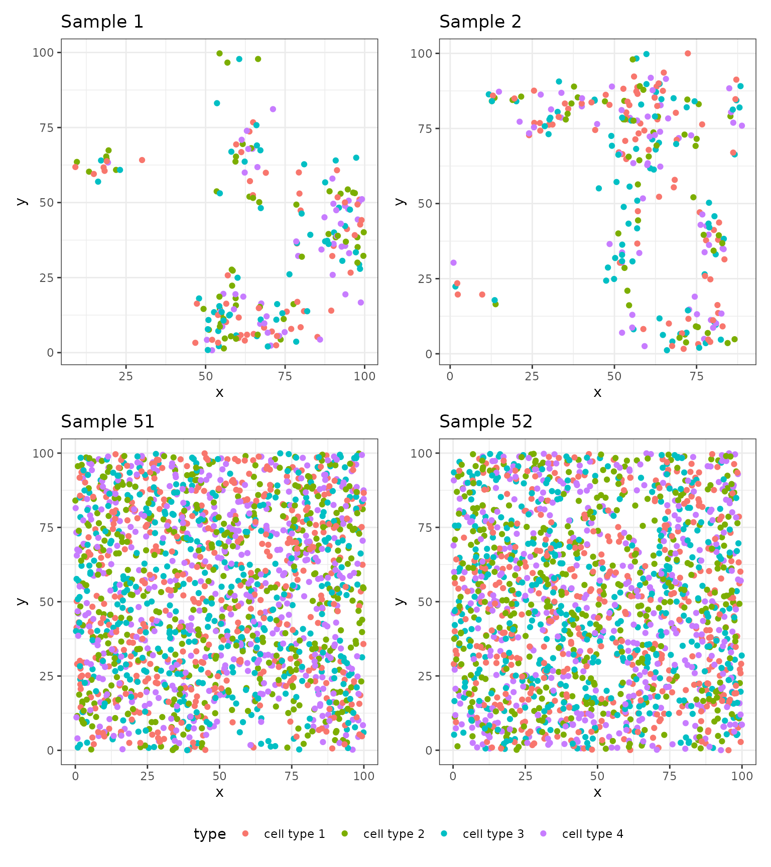 ## Applying TopKAT
The goal of TopKAT is to test whether images with similar geometric structures created by cells correspond to patients with similar outcomes (in this case, survival). The null and alternative hypotheses for this test are:
: There is no association between survival time and topological structure of cells
: There is an association between survival time and topological structure of cells
If the TopKAT p-value is small, this is evidence against .
We first calculate the kernel matrices which quantify the similarity
between images using the function rips_similarity_matrix.
Note that we compute a separate kernel matrix for connected components
and loops. In other words, we first compare the images on the basis of
connected components and then on the basis of loops, yielding two
matrices quantifying the pairwise similarities among the images. Later,
in our kernel association test, we will aggregate across these matrices
to yield an omnibus test of association.
Below, we show how to calculate the kernel matrices using
rips_similarity_matrix using a maximum distance of
.
# Compute the similarity matrix
simmat <- rips_similarity_matrix(data2.df, max.threshold = 142, print.progress = FALSE)
We illustrate here two visualizations. First, we visualize the corresponding persistence diagrams for the four samples shown above. The latter two samples show homologies born at much smaller distances, reflecting how much closer cells are in samples through .
# Plotting the persistence diagrams
pd1 <- plot_persistence(simmat$rips.list[[1]], title = "Patient 1", dims = c(50, 50))

pd2 <- plot_persistence(simmat$rips.list[[2]], title = "Patient 2", dims = c(50, 50))

pd3 <- plot_persistence(simmat$rips.list[[51]], title = "Patient 51", dims = c(50, 50))

pd4 <- plot_persistence(simmat$rips.list[[52]], title = "Patient 52", dims = c(50, 50))

# Arrange the plots
(pd1 + pd2 + pd3 + pd4 & theme(legend.position = "bottom")) + plot_layout(guides = "collect")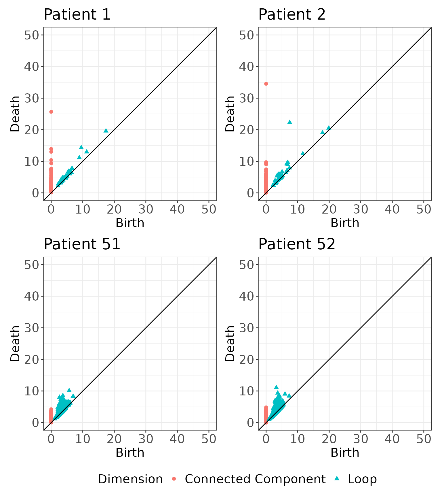
We also show a visualization of the kernel matrices to describe the similarities among the images. Note that the similarity values in the kernel matrices are not interpretable on their own and can only be used to compare the similarities between two pairs of images.
# Visualize the kernel matrices for the connected components
K.cc <- simmat$K.list[[1]] %>%
  reshape2::melt() %>%
  ggplot(aes(x = Var1, y = Var2, fill = value)) +
  geom_tile(color = "white") +
  theme_bw() +
  xlab("Image 1") + ylab("Image 2") +
  ggtitle("Kernel Matrix for Connected Components") +
  theme(legend.text = element_text(angle = 45, hjust = 1))


# Visualize the kernel matrices for the loops
K.loop <- simmat$K.list[[2]] %>%
  reshape2::melt() %>%
  ggplot(aes(x = Var1, y = Var2, fill = value)) +
  geom_tile(color = "white") +
  theme_bw() +
  xlab("Image 1") + ylab("Image 2") +
  ggtitle("Kernel Matrix for Loops") +
  theme(legend.text = element_text(angle = 45, hjust = 1))

# Arrange the plots
K.cc + K.loop & theme(legend.position = "bottom")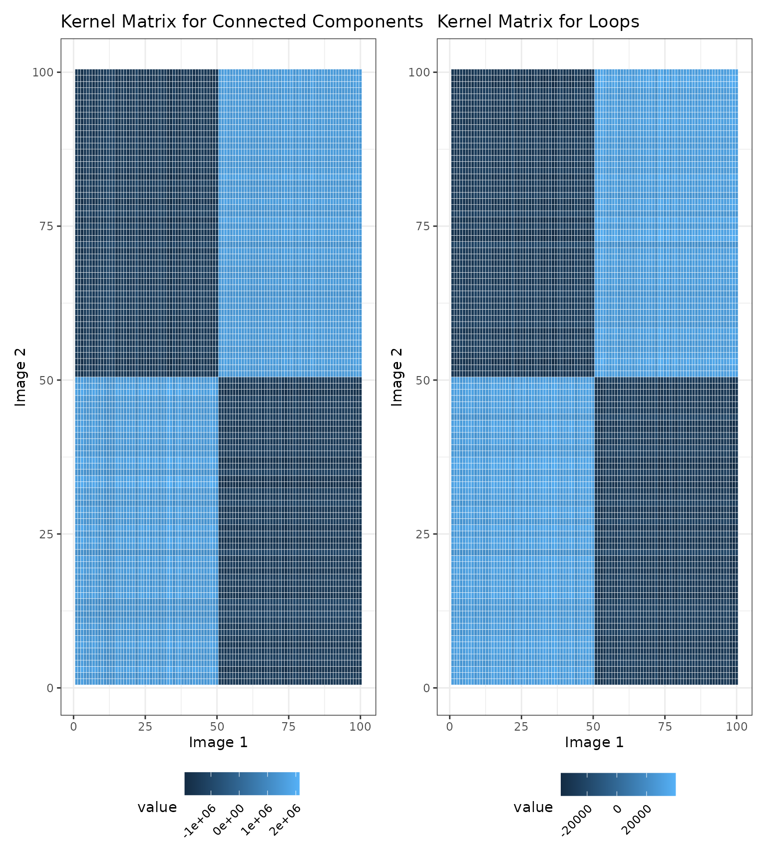
Finally, we can test for an association with survival given the kernel matrices we computed above. Since we have two kernel matrices, we may want to aggregate our association results across both homologies. We will construct a linear combination of the kernel matrices and aggregate results across different mixtures. A straightforward choice of weights is in the following linear combination:
We now apply TopKAT. As shown below, the TopKAT p-value is significant, .
# Applying TopKAT to the simulated data
res <- TopKAT(y = y, X = NULL, cens = cens,
              K.list = simmat$K.list, omega.list = c(0, 0.5, 1),
              outcome.type = "survival")

# Output the p-value
res$overall.pval
#> [1] 2.431229e-05
We can also examine how significant the results are for each linear combination of kernel matrices:
res$p.vals
#>      omega.0    omega.0.5      omega.1
#> 2.575420e-05 2.422430e-05 2.310274e-05
Descriptive Post-Hoc Analyses
We can now explore which distances are most “important” (i.e.,
significant) and assess which cell types are connected at this distance
using the scale_importance function.
res_scale_import <- scale_importance(pd.list = simmat$rips.list,
                                     y = y, cens = cens,
                                     omega.list = c(0, 0.5, 1),
                                     threshold = 100,
                                     PIDs = 1:100,
                                     outcome.type = "survival")
We first examine the sequence of p-values at each distance The distance at which the minimum TopKAT p-value arose was .
# Create a data.frame
res_scale_import.df <- data.frame(
  thresh = res_scale_import$threshold.seq,
  pval = res_scale_import$pvals
)

# Plot
res_scale_import.df %>%
  ggplot(aes(x = thresh, y = pval)) +
  geom_point() +
  theme_bw() +
  xlab("Distance") + ylab("P-Value") +
  ggtitle("TopKAT Significance at each Distance") +
geom_vline(xintercept = res_scale_import$min.thresh, linetype = "dashed") 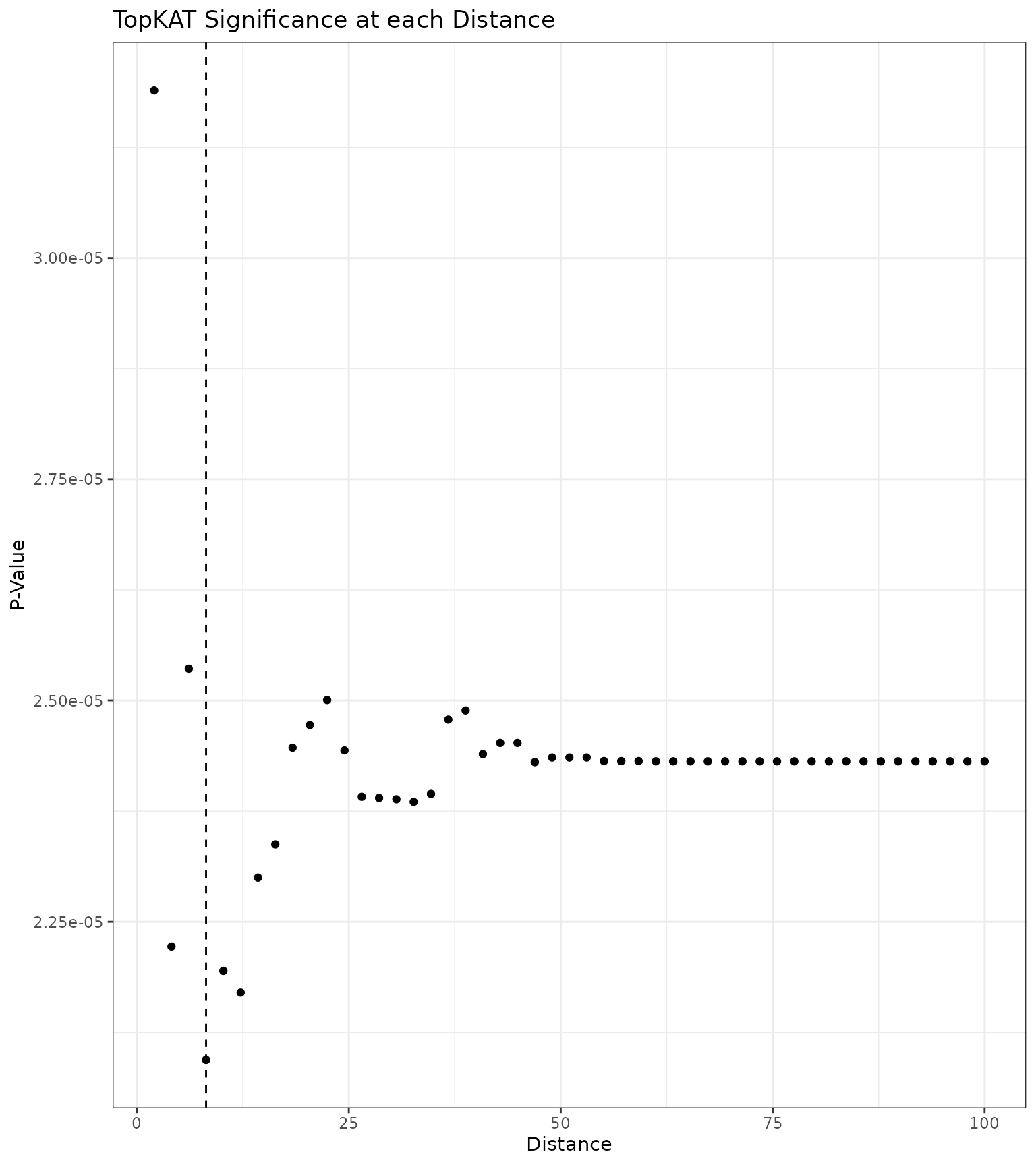
We can also examine what the simplicial complex at this distance looks like for our example images:
# Plot the simplicial complex at r=res_scale_import$min.thresh
sc1 <- plot_cells_with_scale(
  image = data2.df %>% dplyr::filter(PID == 1),
  threshold = res_scale_import$min.thresh,
  title = "Simplicial Complex for \n Sample 1"
)

sc2 <- plot_cells_with_scale(
  image = data2.df %>% dplyr::filter(PID == 2),
  threshold = res_scale_import$min.thresh,
  title = "Simplicial Complex for \n Sample 2"
)

sc3 <- plot_cells_with_scale(
  image = data2.df %>% dplyr::filter(PID == 51),
  threshold = res_scale_import$min.thresh,
  title = "Simplicial Complex for \n Sample 51"
)

sc4 <- plot_cells_with_scale(
  image = data2.df %>% dplyr::filter(PID == 52),
  threshold = res_scale_import$min.thresh,
  title = "Simplicial Complex for \n Sample 52"
)

# Arrange the plots
sc1 + sc2 + sc3 + sc4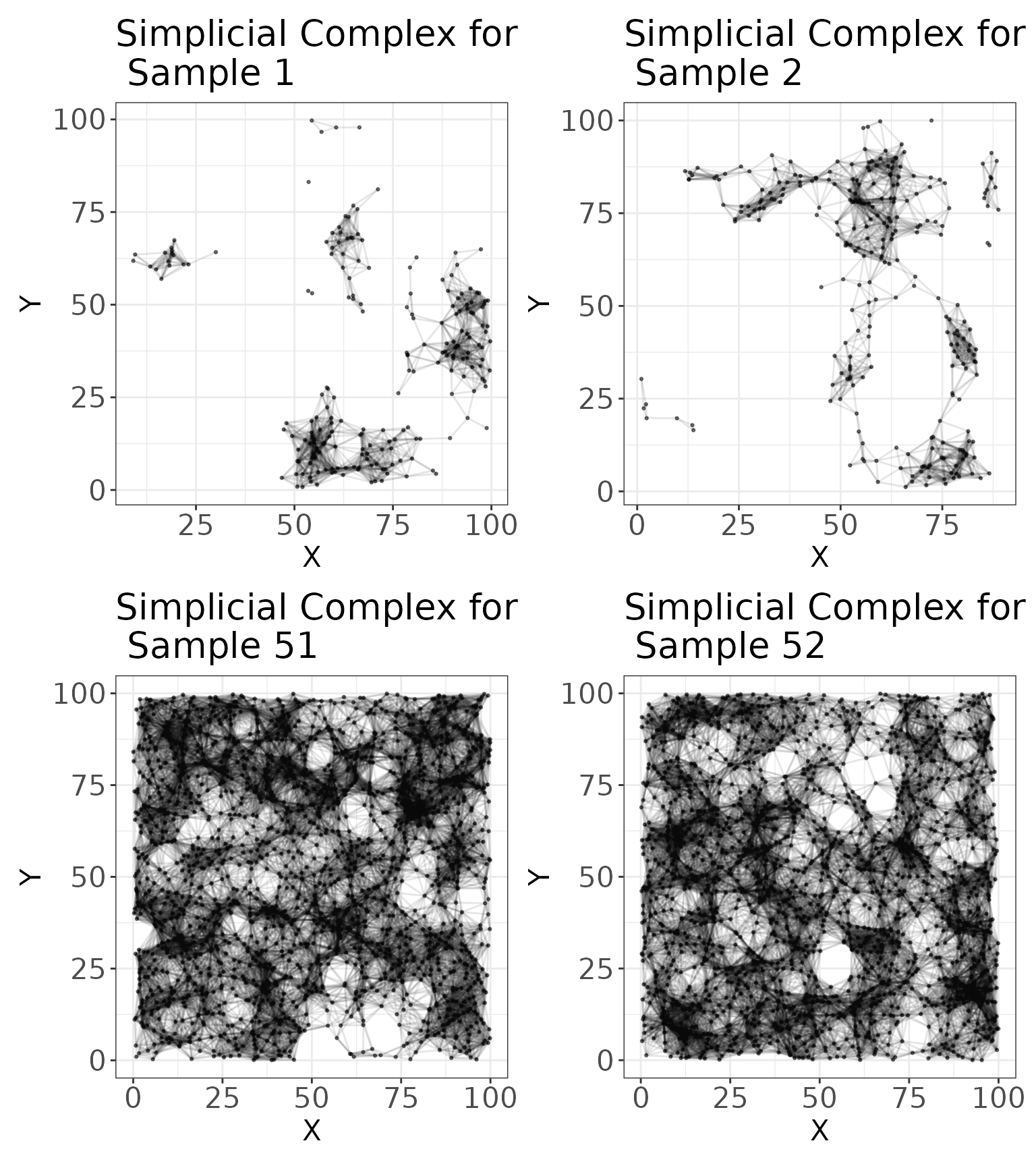
Finally, we can examine the connectivity of the cell types at this distance using connectivity matrices. These matrices enumerate how many connections there are between cells at . We visualize these matrices for the four samples given above.
# Connectivity matrices
c1 <- plot_cell_connections(
  image = data2.df %>% dplyr::filter(PID == 1),
  threshold = res_scale_import$min.thresh,
  title = "Cell Connectivity for Patient 1",
  type.column = "type",
  unique.types = unique(data2.df$type)
) + labs(fill = "# of Connections")

c2 <- plot_cell_connections(
  image = data2.df %>% dplyr::filter(PID == 2),
  threshold = res_scale_import$min.thresh,
  title = "Cell Connectivity for Patient 2",
  type.column = "type",
  unique.types = unique(data2.df$type)
) + labs(fill = "# of Connections")

c3 <- plot_cell_connections(
  image = data2.df %>% dplyr::filter(PID == 51),
  threshold = res_scale_import$min.thresh,
  title = "Cell Connectivity for Patient 51",
  type.column = "type",
  unique.types = unique(data2.df$type)
) + labs(fill = "# of Connections")

c4 <- plot_cell_connections(
  image = data2.df %>% dplyr::filter(PID == 52),
  threshold = res_scale_import$min.thresh,
  title = "Cell Connectivity for Patient 52",
  type.column = "type",
  unique.types = unique(data2.df$type)
) + labs(fill = "# of Connections")

# Arrange the plots
c1 + c2 + c3 + c4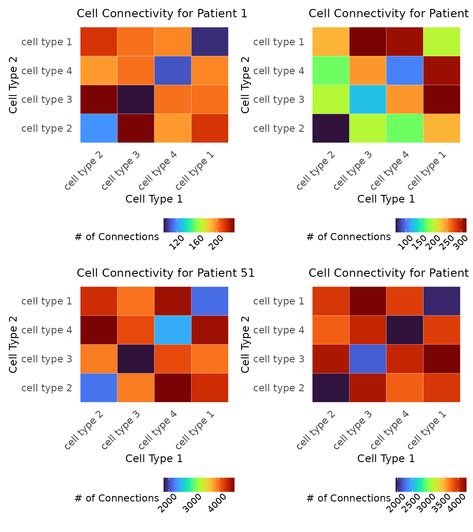
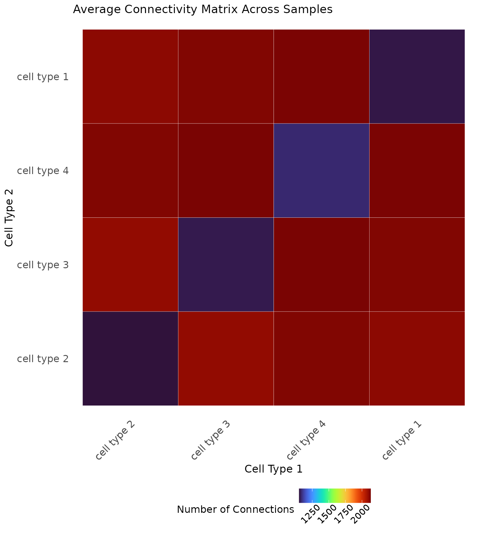
It can also be illustrative to compute an average connectivity matrix across the whole cohort or within known patient samples, as shown below.
# Save the cell types
cell.types <- as.character(unique(data2.df$type))

# Connectivity matrix for mixed and segregated
connect <- matrix(0, nrow = length(cell.types), ncol = length(cell.types),
                     dimnames = list(cell.types, cell.types))

# Iterate through the samples
for (i in 1:100) {

  # Save the data
  patient <- data2.df %>% dplyr::filter(PID == i)

  # Plot the scale importance
  connect.i <- generate_connectivity(images.df = patient,
                                     threshold = res_scale_import$min.thresh,
                                     type.column = "type",
                                     unique.types = cell.types)

  # Match the rows and columns in case an image was missing a cell type
  match.rows <- match(rownames(connect.i), cell.types)
  match.cols <- match(colnames(connect.i), cell.types)

  # Add to the matrix
  connect[match.rows, match.cols] <- connect[match.rows, match.cols] + connect.i

}

# Take the average
connect <- connect/100

# Visualize
ggplot(reshape2::melt(connect), aes(Var1, Var2, fill = value)) +
    ggplot2::geom_tile(colour = "white") +
    viridis::scale_fill_viridis(option = "turbo") +
    ggplot2::labs(x = "Cell Type 1", y = "Cell Type 2", fill = "Number of Connections") +
    ggplot2::theme_minimal() +
    ggplot2::theme(axis.text.x = element_text(size = 12, angle = 45, hjust = 1),
          axis.text.y = element_text(size = 12),
          axis.title = element_text(size = 13),
          panel.grid.major = element_blank(),
          panel.grid.minor = element_blank(),
          legend.position = "bottom",
          legend.title = element_text(size = 12),
          legend.text = element_text(size = 11, angle = 45, hjust = 0.75),
          plot.title = element_text(size = 14)) +
    ggplot2::ggtitle("Average Connectivity Matrix Across Samples")